Showing posts with label Font Unit. Show all posts

Monday, November 13, 2017

Collaborating for the Final Font

In class, we were able to meet with our sponsor to talk more about what the escape room is going to use our font for. He was really excited about the prospect of working with a unique student project for his escape room, which was so cool! He said that the escape room was timed, and participants had to escape before the Yeti caught up with them. The room would be designed like a rustic base camp, with a crudely built tent, fires, and furs. Our font would be used on the posters advertising the escape room, accompanied by the logo of the escape room.

After hearing about the escape room's concept, all of us students were able to share our preliminary fonts and the concepts behind the fonts. We then paired up based on the direction we wanted to take our fonts. Myself and Katie Vasconcelos paired up because we really wanted to start fresh based off of our sponsor's description of the escape room. We wanted to portray that rustic, Himalayan vibe in our font.

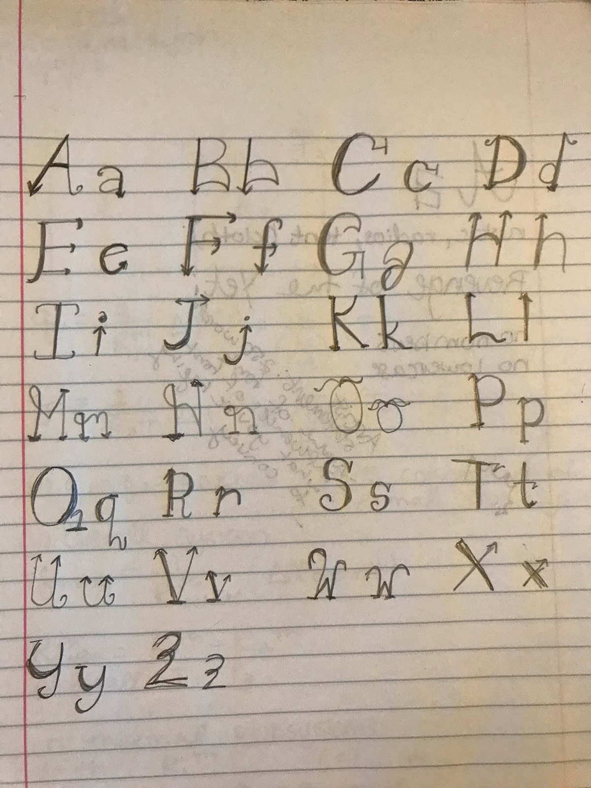
The process of creating the font was quite an adventure. We drew the letters out by hand and then scanned them into Adobe Illustrator. Once in vector format, we projected the letters up onto an overhead projector and perfected them to make sure they would look good from far away.

Slightly struggling

We wrestled with Illustrator for quite a while, but we finally got all of our letters to look satisfactory, and we were both really pumped with how all of our logos came out!

Our alphabet!

Banner format with the logo

Landscape layout for flyers

Portrait layout for flyers


Layout without the Yeti logo

We also composed an artist statement for our font:


"We designed our font, Rune, as a title font for a Yeti-expedition themed escape room. In designing this font, the goal was to entice WPI students to experience the “Revenge of the Yeti”. Some of the influence for the font came from the Nepali language. Each character in Nepalese has a straight line across the top, and each letter has both sharp corners and soft edges. Rune incorporates sharp lines and corners combined with slightly rounded edges and softer points. It resembles the jagged mountain tops, shown by the arms of the letters, the snow on the mountain, shown by rounded corners, and the harsh fangs of a yeti, shown by tooth-like serifs. The overall design of Rune, with its appearance of being carved into wood, resembles the final sign an explorer sees before ascending to the base camp of Mount Everest. Our font was originally hand drawn, much like a carved wooden sign, and then enhanced using Adobe Illustrator. The lines that compose each letter are slightly different, with serifs that are not the same size and downstrokes that are not completely straight to give the font a hand carved feeling. Rune serves to caution an explorer from imminent danger, while conveying the harsh cold and ancient surprises of the mountain."

Overall, this project was really awesome! It was challenging to develop a font from scratch, and I definitely have a newfound appreciation for font design. At the same time, it was an extremely rewarding and fun project. It's so awesome to be able to look at a fully formed logo that YOU created! I also was able to develop a much better understanding of how to use Adobe Illustrator, and I'm definitely looking forward to using it in the future, maybe to design posters for my own events!


Wednesday, November 8, 2017

Figuring Out Fonts

Now that I had a good understanding of Yetis and their habitat, I began to think about what my font should look like. I looked to a couple of different sources for inspiration. Being the innovative thinker that I am, I typed "Yeti Font" into my google search bar and this image was the first thing that came up:
Source: https://www.123rf.com/photo_43767905_stock-vector-yeti-font-vector.html

The little yeti dude is pretty cute and I really like the color scheme. But the design relies so heavily on the color scheme, I don't think viewers would see that the font is yeti themed if it were printed in black and white. The letters do remind me of partially melted ice cubes, but for me the resemblance ends there. 

The next font came from a hockey team's logo:
Source: https://www.logoarena.com/logo-contests/the-fort-nelson-yeti-n3145/15 

The font really only reminds me of a yeti because it literally has a yeti right next to it and it's a pale, icy blue. I don't think this font could stand on its own in black and white. It's too plane and basic, and not reminiscent enough of a yeti expedition. 

The next logo I found was a sticker for the popular cooler brand, Yeti coolers. 

Source: https://dribbble.com/shots/788063-Yeti?list=users&offset=34

This font was a cool interpretation of the Western cartoon style of the Yeti. I really enjoyed the thicker-set letters, reminiscent of the vastness of the Yeti, and the furry quality that the letters have. This font could be better for a logo with the yeti, but I wasn't sure if this style could bring the Yeti to mind if it were just standing alone.

Through a sudden brainwave, I thought of my favorite Disney ride, Expedition Everest. Disney is pretty much the gold standard for all things design in my opinion, so I was excited to take my newfound artist's eye to evaluate Disney's logos.

BINGO! Disney did it again! These two logos had the vibe I wanted for my font. 

Source: http://wondersofdisney.disneyfansites.com/clipart/logos/ak/ak.html 
I really liked the logo for expedition everest, especially how it incorporated the eyes of the Yeti and the mountaintop of everest. The font itself probably wouldn't immediately bring the viewer to think of the Yeti, but the overall logo is extremely effective.
                                    
The second logo (on the sign on the side of the mountain) seemed to draw influence from the Nepali language, something that I definitely wanted to incorporate. After my research, their font just screamed Himalayas.


Source: https://www.undercovertourist.com/orlando/disneys-animal-kingdom/expedition-everest-legend-forbidden-mountain/ 


Source: http://www.omniglot.com/writing/sikkimese.htm

I definitely wanted to incorporate the Nepali influence in my font. I took my unsteady artist's hand and tried my luck at designing the first draft of my font. I tried to base each of my letters on its corresponding Nepali letter.

Honestly, the overall lettering was pretty messy, but I am pretty satisfied with my first draft. I'm definitely looking forward to talking with our sponsor, and I'm really looking forward to collaborating with another student.


Monday, November 6, 2017

Starting a Yeti Expedition

Hello and welcome to my WR2310 blog! In WR2310, or visual rhetoric, we recently began our fonts unit. So far, we have read several academic articles about the impact that fonts, layout, and graphic design have on the reader's perception of the words on the page. We also watched Gary Hustwit's documentary Helvetica, which detailed the profound impact that one extremely well-designed font can have on culture.

I had no idea how much I interacted with graphic design and font before exploring these sources! And now that I know about these interactions, I cannot read text without considering how the font affects my perception of the content. So being able to be a part of a font design project is both exciting and daunting - there are so many creative liberties to be taken, and with these liberties there is so much at stake. Designing an effective font should prove to be a fun challenge!

On top of these already high stakes, we are designing a font for an actual client, and the winning font will actually get used! Our client is designing an escape room, a fun interactive game where players have to find clues and solve riddles to unlock the door to the room and escape. These rooms generally follow some sort of narrative, and this particular client's room is designed around escaping from a Yeti Expedition gone awry.

So I'm not going to lie, I haven't gone on too many Yeti expeditions in my day. Through Professor DeWinter's instructions, I had some jumping off points for what a Yeti expedition may include.

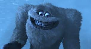
My google search for "Yeti" yielded a lot of pictures of the popular beach cooler, but narrowing my search lead to a lot of images of this cute white dude:
This dudes just here for a good time!
Look at this fuzzy lil dude!

This dude looks so friendly!

I also got a lot of pictures of a much more ominous creature:
Scary!

Intimidating!

And some pictures of a LEGIT ACTUAL YETI:
(Not gonna lie, this looks like a really large snow drift, but Yeti experts say this is the real deal! Hard to argue with that)

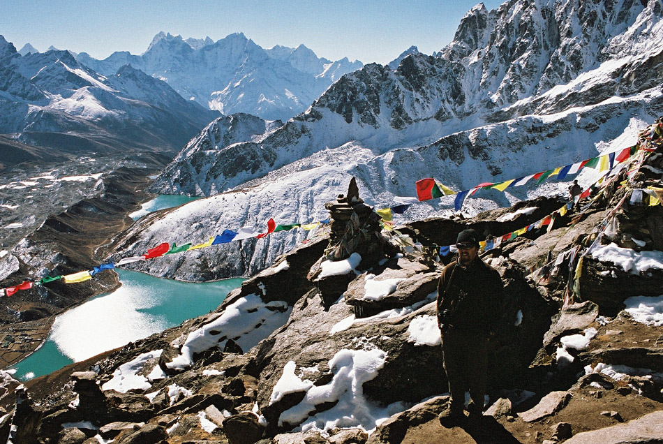
The Yeti is thought to originate from the Himalayas, a mountain range that borders India, Nepal, Pakistan, China, Bhutan, and Afghanistan and is home to the highest peak in the world, Mount Everest.


This image shows a map of the Himalayas, look how freakin huge that mountain range is! The Himalayas are a relatively young mountain range, formed because of the collisions of tectonic plates, crushing India into Tibet. (Source: https://en.wikipedia.org/wiki/Himalayas)

The Himalayas from above, the tallest peak is Everest. (Source: http://everestbasecamptrekguide.com/himalayas-pictures/)

Because people are crazy and like a challenge, summiting Mount Everest has been a huge climbing goal for climbers worldwide. This climb is not for the faint of heart, climbers have to be ready to acclimate to extreme changes in altitude, expose themselves to extreme weather, and physically push their bodies to the limit.
(All of these images are from http://everestbasecamptrekguide.com/himalayas-pictures/)

Here are some people climbing towards the summit. Meanwhile, I can barely climb out of bed in the morning.

These crevasses are crazy deep. One wrong step and you're toast. Actually more like a popsicle.


Hikers camp out on the side of the mountain in these tents, burying them into the side of the mountain. I'm no mountaineer, and those look like they would be cold, uncomfortable, and dangerous.

The wind can reach up to 175 mph. Jinkies!

Good views though! I'll let the experts take the pictures so I can view them from my nice, warm bed.

Believe it or not, people actually LIVE in these mountains! People from the mountainous region of Nepal are known as Sherpas. They're generally regarded as expert hikers and mountain guides, and those looking to summit Everest often turn to them for advice. Even after a huge avalanche killed sixteen of the Sherpa community, Sherpas still return each season to guide climbers.
Carrying supplies for hikers. Imagine walking up the tallest mountain in the world with freaking SO MUCH STUFF ON YOUR BACK?!?!?! Source: https://www.vice.com/sv/article/7bm9n9/sherpa-describe-why-they-returned-to-everest-after-the-deadliest-season-ever


Through my preliminary research, I have learned quite a few things: 
  1. Sherpas are badasses.
  2. The Himalayas are crazy huge, so there could very well be a Yeti in there somewhere.
  3. Yetis could be cute, scary, or snowdrifts.
  4. I have my work cut out for me designing this font!
Sources:
http://www.pbs.org/wnet/nature/the-himalayas-himalayas-facts/6341/
http://www.scmp.com/magazines/post-magazine/travel/article/2104896/good-bad-and-ugly-sides-climbing-mount-everest
http://everestbasecamptrekguide.com/what-is-a-trek-in-nepal/
https://www.vice.com/sv/article/7bm9n9/sherpa-describe-why-they-returned-to-everest-after-the-deadliest-season-ever