Now that I had a good understanding of Yetis and their habitat, I began to think about what my font should look like. I looked to a couple of different sources for inspiration. Being the innovative thinker that I am, I typed "Yeti Font" into my google search bar and this image was the first thing that came up:
The little yeti dude is pretty cute and I really like the color scheme. But the design relies so heavily on the color scheme, I don't think viewers would see that the font is yeti themed if it were printed in black and white. The letters do remind me of partially melted ice cubes, but for me the resemblance ends there.
The next font came from a hockey team's logo:
 | ||
| Source: https://www.logoarena.com/logo-contests/the-fort-nelson-yeti-n3145/15 |

The font really only reminds me of a yeti because it literally has a yeti right next to it and it's a pale, icy blue. I don't think this font could stand on its own in black and white. It's too plane and basic, and not reminiscent enough of a yeti expedition.
The next logo I found was a sticker for the popular cooler brand, Yeti coolers.
 |
| Source: https://dribbble.com/shots/788063-Yeti?list=users&offset=34 |
Through a sudden brainwave, I thought of my favorite Disney ride, Expedition Everest. Disney is pretty much the gold standard for all things design in my opinion, so I was excited to take my newfound artist's eye to evaluate Disney's logos.
BINGO! Disney did it again! These two logos had the vibe I wanted for my font.
 |
| Source: http://wondersofdisney.disneyfansites.com/clipart/logos/ak/ak.html |
The second logo (on the sign on the side of the mountain) seemed to draw influence from the Nepali language, something that I definitely wanted to incorporate. After my research, their font just screamed Himalayas.
 |
| Source: https://www.undercovertourist.com/orlando/disneys-animal-kingdom/expedition-everest-legend-forbidden-mountain/ |
 |
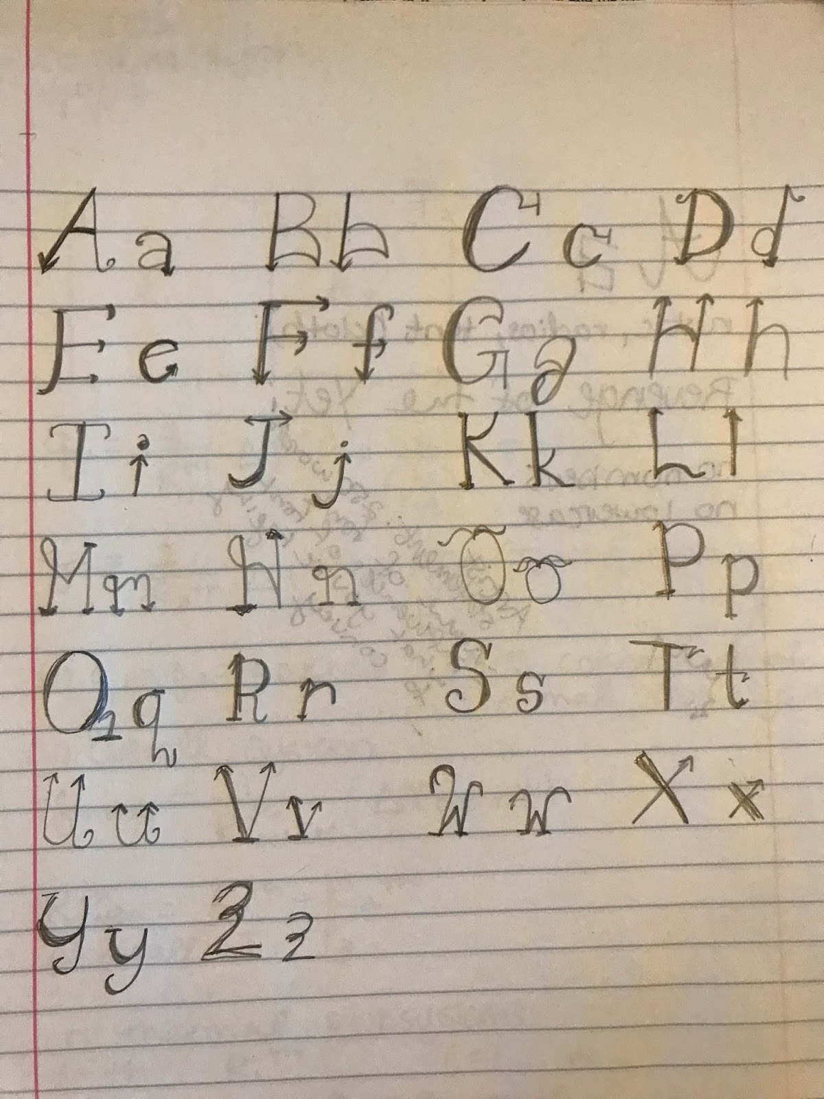
Honestly, the overall lettering was pretty messy, but I am pretty satisfied with my first draft. I'm definitely looking forward to talking with our sponsor, and I'm really looking forward to collaborating with another student.
I really liked how you took different existing Yeti fonts to get inspiration from and analyzed what was effective and what wasn't about them. It will definitely give you an edge to know what is already on the market. You can make the conscious choice of following some expected trends or of starting your own.
ReplyDeleteYou've done a good job seeking out and critiquing pre-existing yeti-themed fonts, and I'm inclined to agree with your assessments. However, I would like to hear more of your thoughts on what would actually make a good yeti font, rather than just the ways in which others have been unsuccessful. Do you have any specific commentary on the last three fonts you provided examples of?
ReplyDeleteI really like all of the different images you searched to use as inspiration for the first draft of your font. The different images combine a more friendly yeti feel as well as one that is more serious. I really like the logo from Disney's Expedition Everest. Not only does it combine a font that resembles the fur of a yeti, but it also depicts the face of the yeti you may encounter on the ride.
ReplyDeleteYour first draft looks pretty good. I am interested in seeing how your font has formed over the past few days. Are you planning on posting images of further drafts?
ReplyDelete