
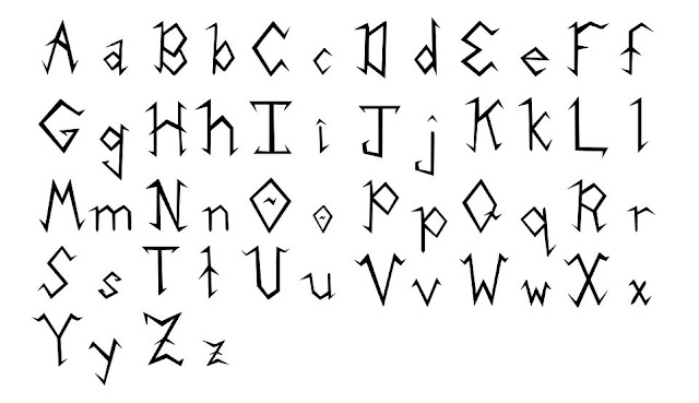
Katie and I met one more time to finish up our font unit. This was actually a really fun meeting because we both realized what a powerful tool Illustrator can be when it isn't so frustrating! To finalize our letters, we took our recreated letters and deleted the rounded letters behind it. We then focused on finalizing all of our serifs so that there would be consistent patterns between groups of letters. We matched the serifs on the left side of the B, D, and F. We used two upwards facing serifs on the bottom of the A, H, M, N, R and X. We kept the two, fang-like serifs on the top of the I, J, and T the same, mimicking that serif at the bottom of the L. We wanted more of a motif of the upward facing serifs on the top of our original E, so we added upwards-facing serifs at the top of our F, G, U, V, W, X, and Y. We also wanted to continue the zig-zag, lightning-shaped accent in the Q, so we added that element to the A, O, and Z. The small changes we made created a more jagged feel for all the letters, as well as a more uniform alphabet overall.
 |
| Our final font!!! |
 |
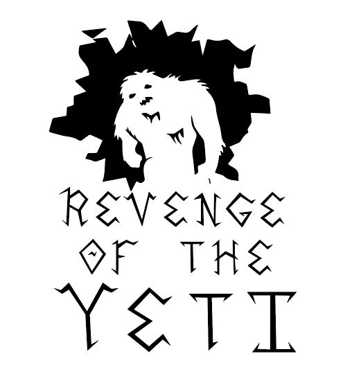
| Our font with the Yeti dude! |
 |
| Yeti Dude is back! |
 |
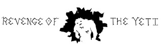
| Our font with the escape room logo again |
 |
Our standalone logo
|
We also revised our Artists' Statement:
Our font, entitled “Rune”, is designed as a title font for the Yeti expedition themed WPI escape room. Our purpose in designing this font is to not only create a font that can be used on the different forms of advertisement for the escape room, but also to create a font that will entice readers that register for and enter into the “Revenge of the Yeti”. Our audience is current WPI students as well as WPI faculty, and our goal was to persuade viewers that the escape room is a harsh, cold Yeti expedition. Much of the design influence for this font came from ancient runes, hence its name. Rune combines singular straight lines to form its upper and lower case letters, similar to Western Greek and Archaic Etruscan alphabets. The letters “K”, “L”, “B”, “M”, and “N” from the Etruscan alphabet particularly influenced our design choice to include serifs on some of our letters as well as to turn the rounded edges of letters such as B, D, G, and O into diamonds. In particular, the letter R heavily influenced our design choices. We decided to extend the letter to resemble a mountain for one of our logos, which gave the edges an overall sharper feel. We continued this sharp motif in the other letters to give them a fractured, hand drawn feel. We wanted to portray a wood-carven appearance, as if someone had used a Swiss Army Knife to carve the alphabet into wood. We also wanted to create sharp, icicle-like serifs to remind the viewer of the harsh hold of the mountain. Rune serves as a caution to readers of the surprises that await on the mountain.
At first, I was honestly kind of dreading this revision, but now I am so glad that we did! It looks SO much better, and it really brought me full circle in this class and showed just how much I learned through Visual Rhetoric. Here are just a few things I took away from this course:
- Don't be scared of using "big girl" programs like Illustrator and Photoshop - they are SO powerful and a lot of your questions can be answered by Google search!
- You can re-imagine a project in a bajillion different ways! There's no limit to a genre when you have your imagination and a fresh perspective.
- You could work on a design project for years and still not feel like it's done. There is always room for improvement.
- EVERYTHING is working to convince you, and you can consciously work to convince others.
- Design is SO HARD and I give designers SO much credit (something I knew before but didn't fully realize until this course).
- Design can be frustrating but it is SO FUN and you can do so much with a simple idea and a good imagination!


No comments:
Post a Comment